Monzo is a new kind of bank. One that lives on your smartphone and built for the way you live today.
Improving on-boarding
Our job as designers is to create great products by making sure that everything works well and that people can easily use it and accomplish their tasks in a quick and efficient way. The way we can do that is by designing with our users in mind and try to understand people’s needs.
Users research is a route towards that understanding and helps inform our design decisions. This is why we’ve asked some of our customers — who had just signed up but not yet activated their cards — to come into the office, where we watched them interact with the Monzo app for the first time.

We learned a lot through observation and were able to spot all the main issues our people were experiencing. From there, we summarised all the key takeaways and decided to take action on three main areas:
Welcome message
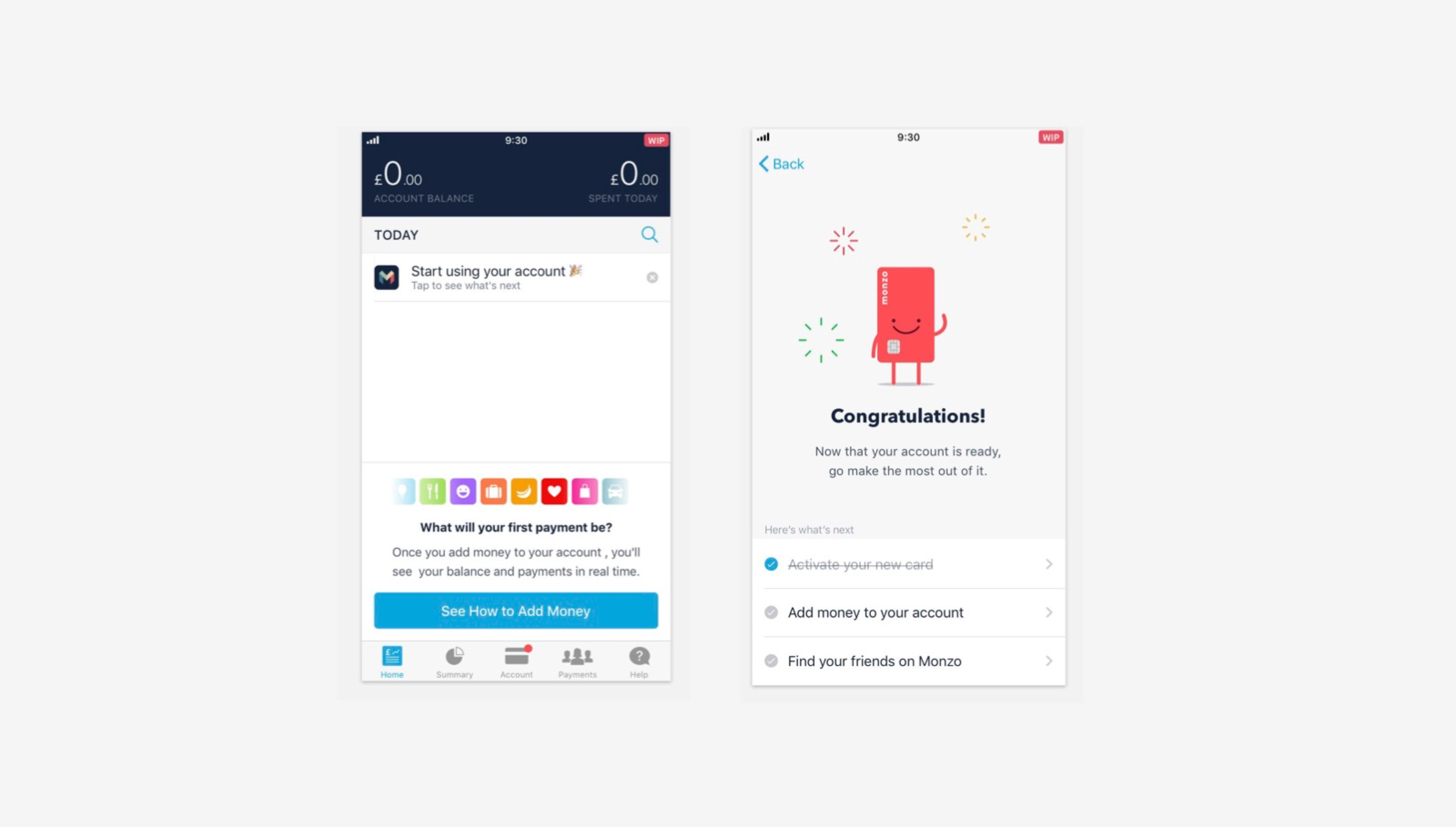
When people open the app for the first time, they don’t know what to expect or what are the next steps. They’re just presented with a blank screen and need to figure out the rest.
We decided to introduce a better welcome message which, like a good host, can guide through the different rooms of the app making the whole experience more engaging.
Card Activation
We found out that about a third of our customers did not easily find the button to activate their card in the Account tab on their first attempt. They didn’t even know that they had to activate the card before they could use it. Some of them eventually found it, others went through Help instead.
We decided to improve the design, by making it more obvious that you need to activate your card: the card will now look faded out to give a visual clue that it’s not in its active state.
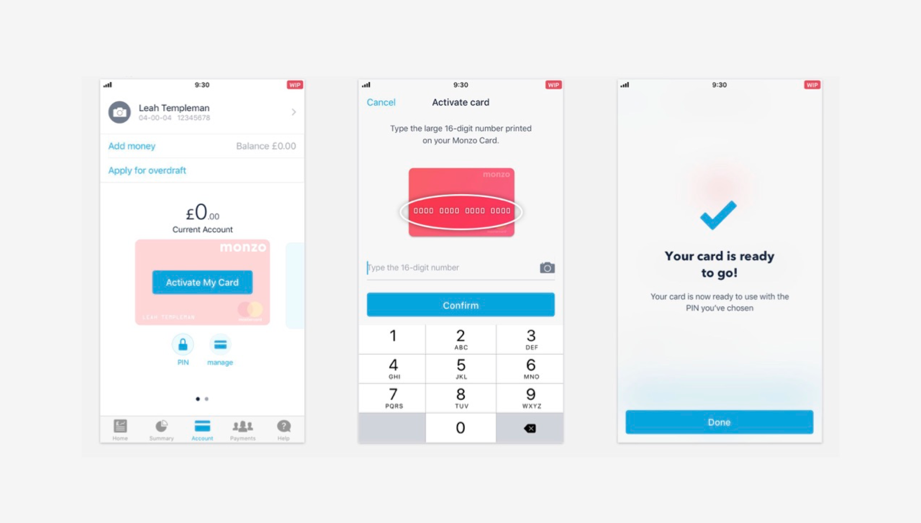
“Card activation process looks much better. A couple of times I’ve tried to spend on a new Monzo card without realising I needed to activate. ” Customer feedback
Add money to your account
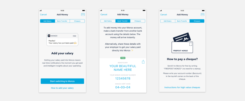
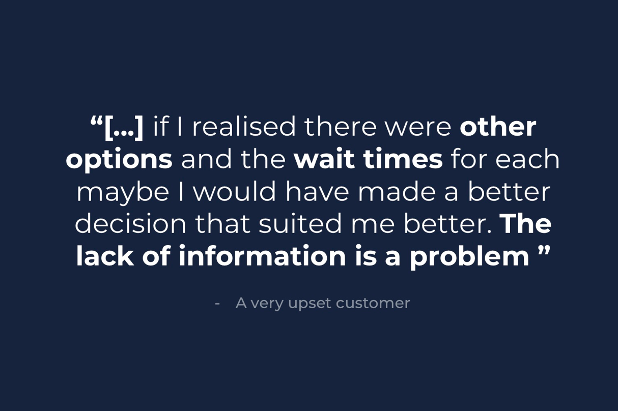
There was some confusion over how to add money to their account for some customers. When they tapped on Add Money they were told about salary, bank transfers and cheques straight away and we were not giving them enough information about fees or turnarounds nor walking them nicely towards all the different options.
Some customers didn’t even understand that they needed to do a bank transfer from another bank account in order to add money!
The new approach
This is why we revisited the whole flow to make it more comprehensive with explanations of what's offered in Monzo and how things work.
We decided to show all of the different options in a more organized way and easier to understand, with fee information and waiting times upfront. Only once you tap on an option we display related instructions.
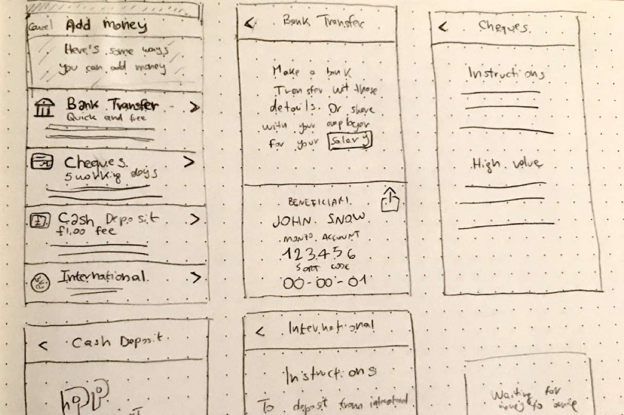
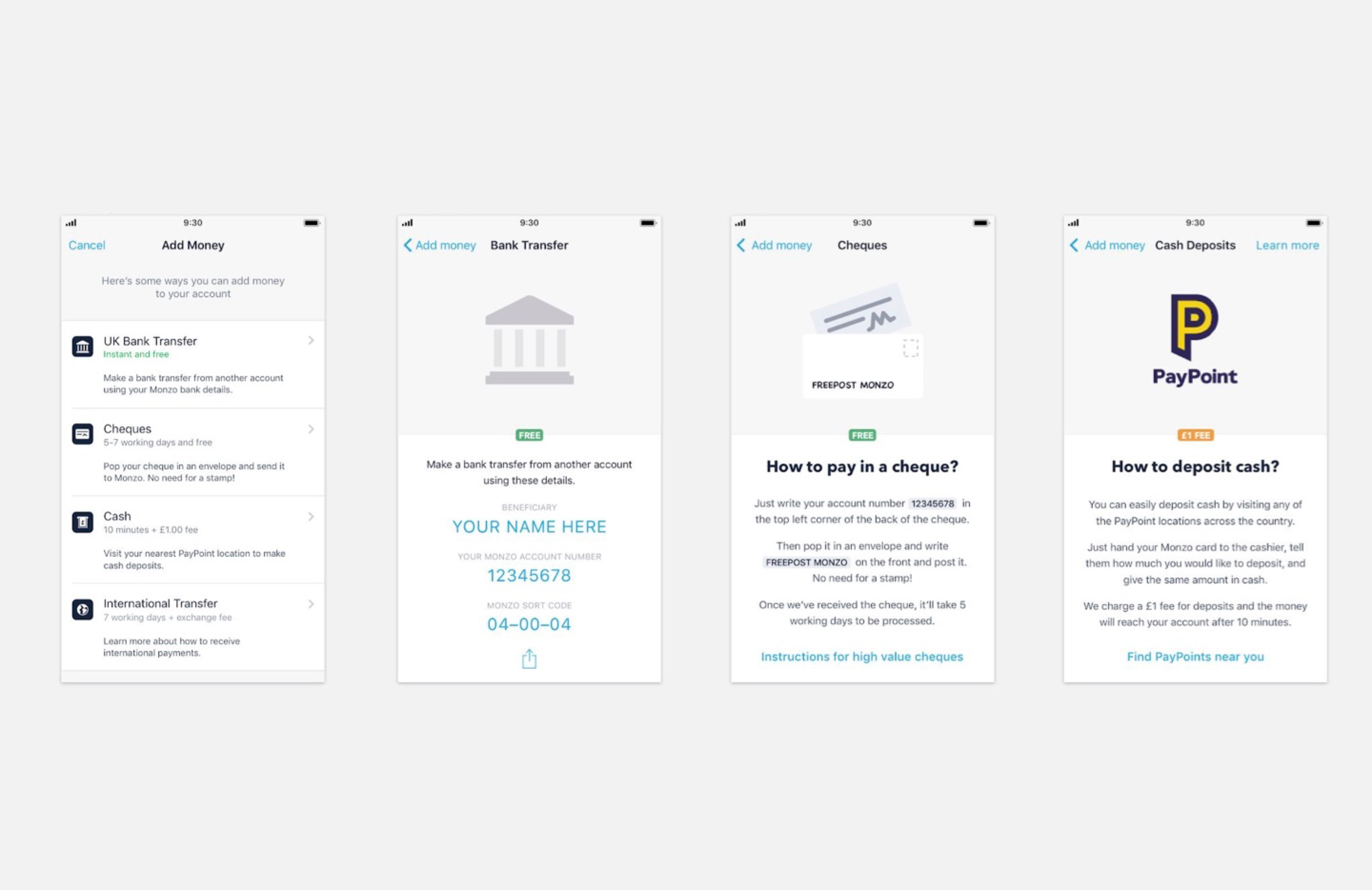
This layout is more flexible and future-proof if we want to add/remove options. Even though it adds an additional layer, it has the benefit of being more organized and walks you through all the different options instead of throwing all of them at you, especially when you’re a first time user and have no idea where to start.
Conclusion
User research findings are just the beginning of the story. Thanks to these, we were able to gather qualitative data and iterate some aspect of our on-boarding that weren’t performing as hoped and improved them to better serve our user’s needs by designing with better informed assumptions.